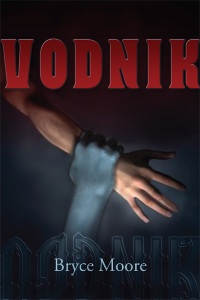
In this two-part guest blog post, designer Isaac Stewart and Tu Books Editorial Director Stacy Whitman discuss how they came up with the final cover for our new YA fantasy, Vodník:
Isaac: Before brainstorming ideas for a book design, I usually get a few pieces of key information from the editor:
1. What age-range and demographic do we want the book to target?
2. What would the editor like the cover to convey?
3. What has the author said they would like to see on the cover?
Here’s how Stacy answered:
1. The book’s design should appeal to both female and male tweens and teens, but should specifically target the male teen.
2. Stacy wanted a cover that felt ominous, fantastical, with a dash of whimsy.
3. Bryce [Moore, the author] specifically mentioned that he found covers with bold shapes and colors both beautiful and striking. But if we decided to go for a more photographic cover, he wanted to see the vodník statue or Trenčín castle.
He also suggested full-color interior illustrations by Michael Whelan, that the exterior title be in dripping water and his author name be on fire. He also asked for a trip to the moon and a hard drive loaded with Scooby-Doo reruns.
Both Stacy’s and Bryce’s input was invaluable in creating cover concepts. I had long conversations with each of them, trying to find that image that would really fit the book. Though their ideas were sometimes disparate, there was still some overlap that I hoped to be able to harness.
So I set to work reading the manuscript. The goal I kept in mind was this: Find a design that would compel the right audience to pick up the book (and make Stacy and Bryce happy in the process).
Stacy: You’ll note that Bryce had quite a bit of input into the process here. With a smaller company, it’s easier to coordinate with the author for suggestions. While we still have to take marketing information just as much into account when planning covers, we want our authors to be happy with the end result. Their ideas help inspire the designer and I think the covers are better for it. I also show my authors concepts–once we’ve narrowed it down to the best possibilities–so they can point out things I might have missed. (For example, Karen Sandler rightly pointed out that we had accidentally put the tattoo on the wrong side of the main character’s face on Tankborn!)
Isaac: I made notes of particularly visual scenes and looked for reoccurring details and symbols that could be translated into the book design. I’ll admit that several times I lost myself in the reading of the book and had to resurface for air and make notes after the fact! (You’ll see what I mean when you get to read the book later this month. It’s breathtaking. And not just because there’s an evil water demon who wants to drown the main character.)
My list of symbols for Vodnik looked something like this:
● Fire
● Water
● Death
● the vodník
● Communism
● traditional Roma designs
● Trenčín Castle
● Slovak fairy tales
● traditional Slovak designs
With the list in mind, I set to work making cover concepts. Easier said than done . . .
Visit part II of our post where Isaac and Stacy discuss some of the covers they came up with for Vodník:


